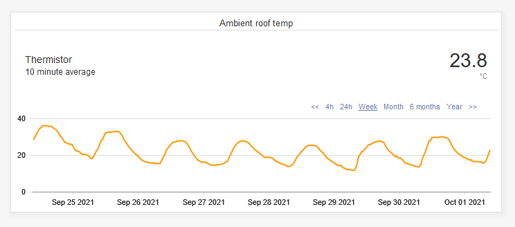
Field Value with Graph
Also see Line Chart widget
General Dashboard and Widget info
Features common to all Widgets and general Dashboard info can be found on the Widgets section of the manual.
Description
The eze.io “Field value with Graph” widget tracks displays a single Field value with a line chart. The numeric value can be removed to show just the graph. The view is a sliding widow of time with most recent data on the right. Viewer can select time frames from 4 hours to 1 year. The window can also be shifted forward or backwards along the time line. This widget is best suited for data that rises and falls over time such as temperature.
Minimum height (grid units) - 4
Features / Options
- 6 Viewer selectable time frame windows
- Show show or hide numeric value
- Arrow forward or backwards along the time line
- Show zero (opt in). Scale of chart is based on range of data values unless “Show zero” is checked“.
Settings
Widget name
Appears top and center of widget
Select field/s
A drop down menu provides the means to link to a specific “Field”, from the desired ezeio.
Text
Enter descriptive text if desired
Text comment
Enter descriptive text if desired
Item color
Click on the color swatch to access the color palette and select a color for the graph.
Graph only
Check the “Graph only” box if you would like to hide the numeric value.
Show zero
By default, the chart will scale to the range of the data, in order to optimize resolution. “Show zero” forces the chart's scale to start at zero or include zero. If values are negative, zero would be at the top of the chart. Example: If your data ranges from 10,500 to 12,500 and you select “Show zero”, your chart will render the 2000 point deviation as a nearly flat line.
