Push Button Widget

Description
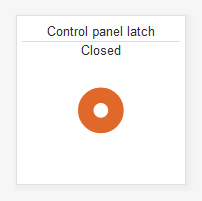
This widget can be used as an actuator or an indicator. The circular button's color changes from between green and red to indicate the state. User defined text can also be added to clarify the state and purpose of the button.
Actuator If connected to a Field that is writable, pushing the button will switch the state of the Field (to a value of 100 or 0, depend on the current state).
Indicator If connected to a field that is not writable, the zero or non-zero value will determine which of the two user defined text statement is displayed.
Pushing the button
When pressed the widget will attempt to set the Field value to 100. A spinning graphic may appear while the system attempts to set the state. When successful, the button color will change to green and the “if true” text will appear. The Field will remain at 100 until another command, action or event changes the value.
True or False
- Field values other than zero are evaluated as True. This includes negative numbers and decimals.
- Zero is evaluated as False
Settings
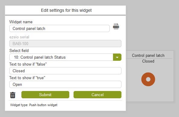
Select field
A drop down menu provides the means to link to a specific “Field”, from the desired ezeio. For more information see mapping on the widgets page.
Text to show if "false"
As stated above, zero is evaluated as False. Enter the desired text to display if false.
Text to show if "true"
As stated above, any non-zero Field value is evaluated as True. Enter the desired text to display if true.