Table of Contents
Widgets
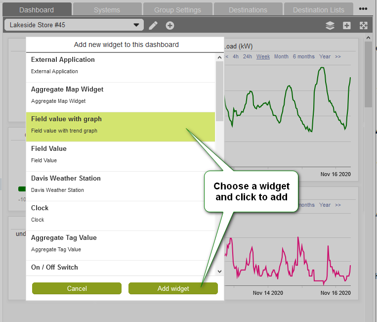
Widgets are individual applications that run within eze.io's Dashboards. The “Add Widget” button described in the previous section, will bring up a list of available Widgets. This list will continue to grow, as new Widgets are developed. Below are a few categories of Widgets.
- Historical Data - Line graph, Stacked Bar Graph
- Instantaneous Data - Field value, Field value as gauge, Field value table
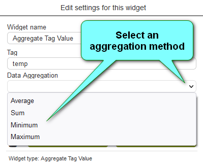
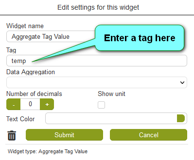
- Aggregated Data - Aggregated Map (shows multiple ezeio locations), Aggregated Tag Value, Circular Gauge (Tag Value & Circular Gauge allow multiple “Field” values to be calculated as sums, average, min or max)
- Control - On/Off Switch, Push Button, Field Value with Editor
- External - External application (can be pointed to a web address to show a website, video, Internet video camera.
- System Info - Clock
- Text - Note widget
Common widget features and functions
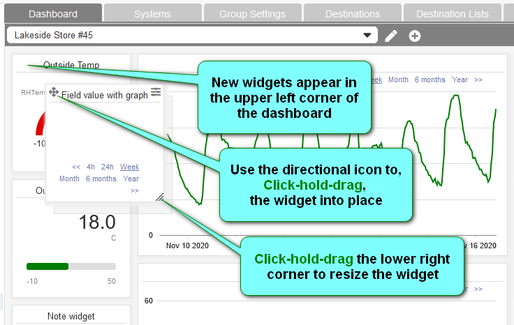

Moving widgets
The direction icon in the upper left corner of all widgets is used like a handle to drag them into position. While hovering over the icon, simply click-hold and drag. As you drag, widgets will snap into position in the invisible grid.
Resizing widgets

The height and width of a widget can be resized by dragging the lower right corner. While hovering over the lower right corner, simply click-hold and drag. A shadow indicates the new size of the widget, snapping to the next grid line as you drag.
Arranging / Layering

Widgets can be placed one above the other partial or totally obscuring the lower layer widgets. The default layer order is based on the order the widgets were created. Use the layer tool on the dashboard header to rearrange the layer order.
Settings

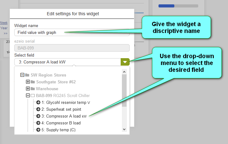
Click on the icon in the upper left corner of the a widget to access it's settings.
Printing

An image of single widget can selected for printing or PDF by clicking the printer icon (upper left) in the “Edit settings” dialog box of all widgets
Mapping
When linking a widget to data source/s two methods are used, selecting via a drop-down-menu and or referencing asset tags.
Select via Drop-down-menu
Most widgets allow the data source/s to be selected via a drop-down-menu, as shown in the image above. A tree of Groups and their ezeio controllers can be expanded to reveal individual fields available as data sources for a widget.
Referencing asset tags
This method is used mainly for aggregate value widgets. These widgets use asset tags (assigned to Fields) as means of incorporating multiple data points into a single value.